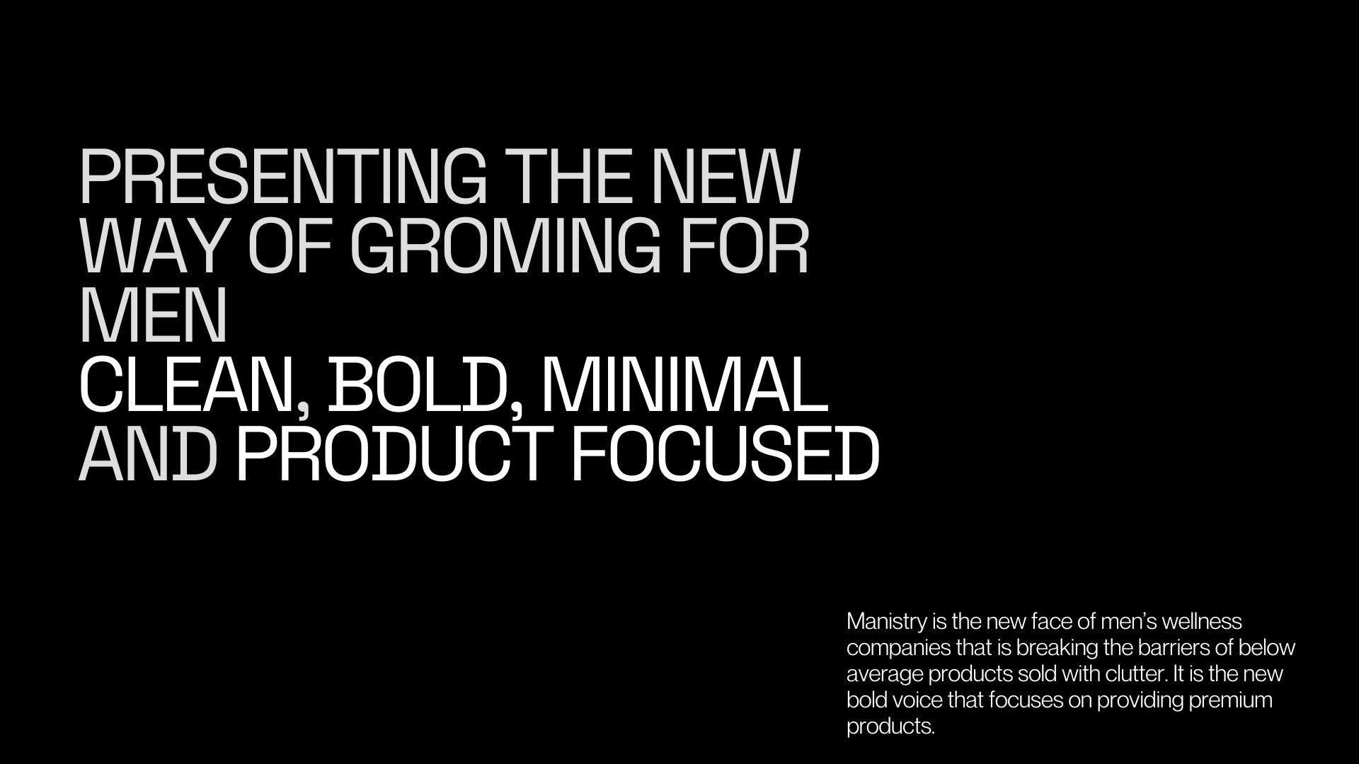
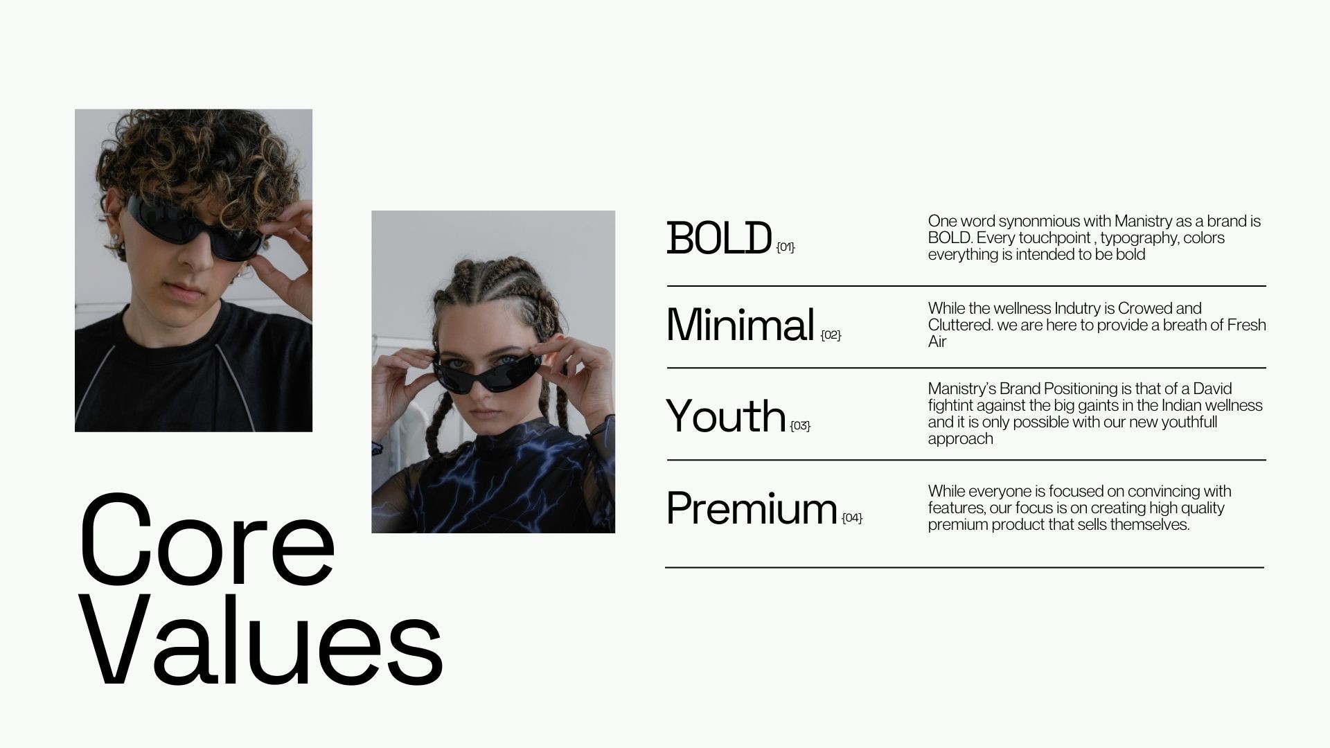
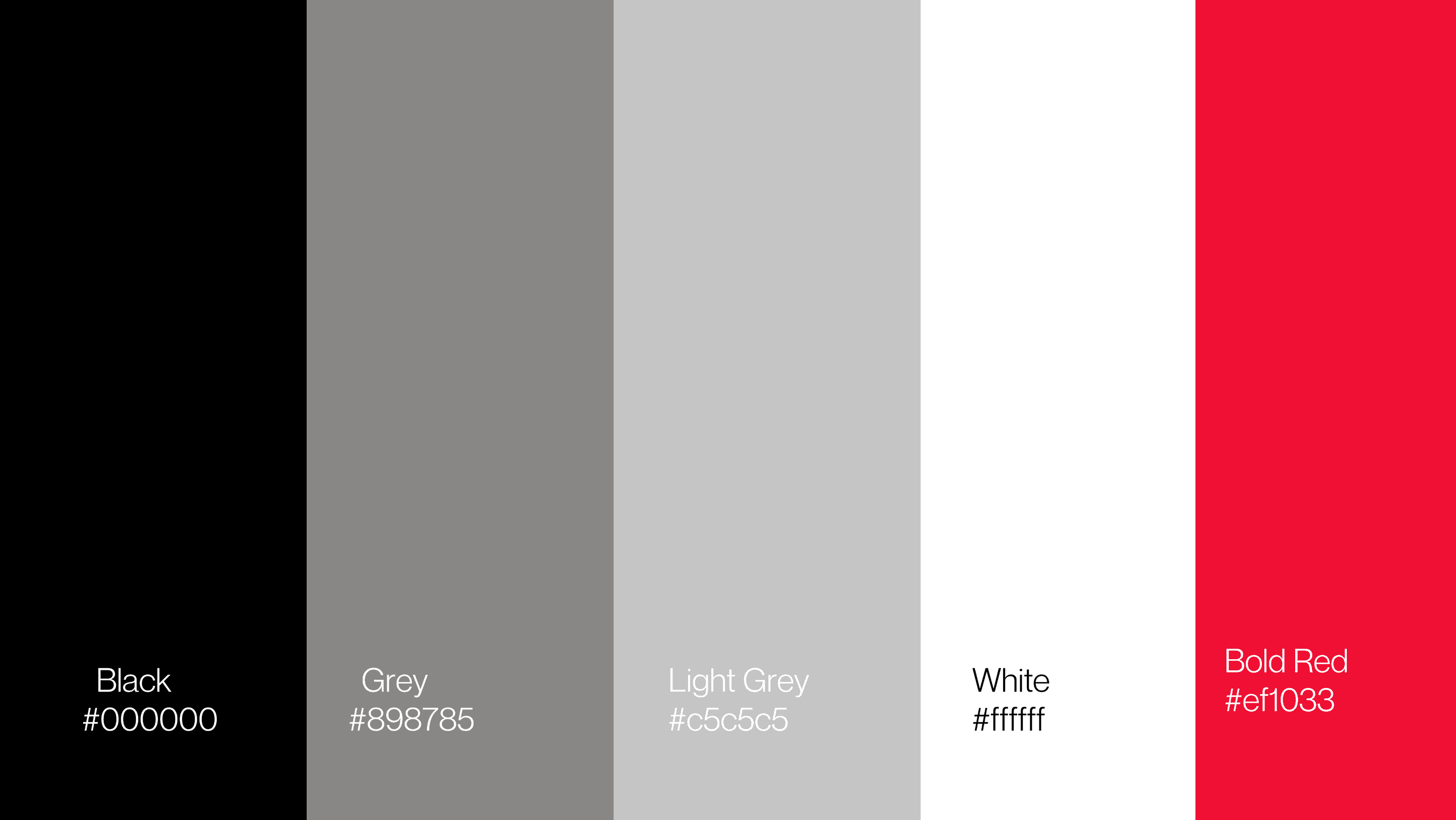
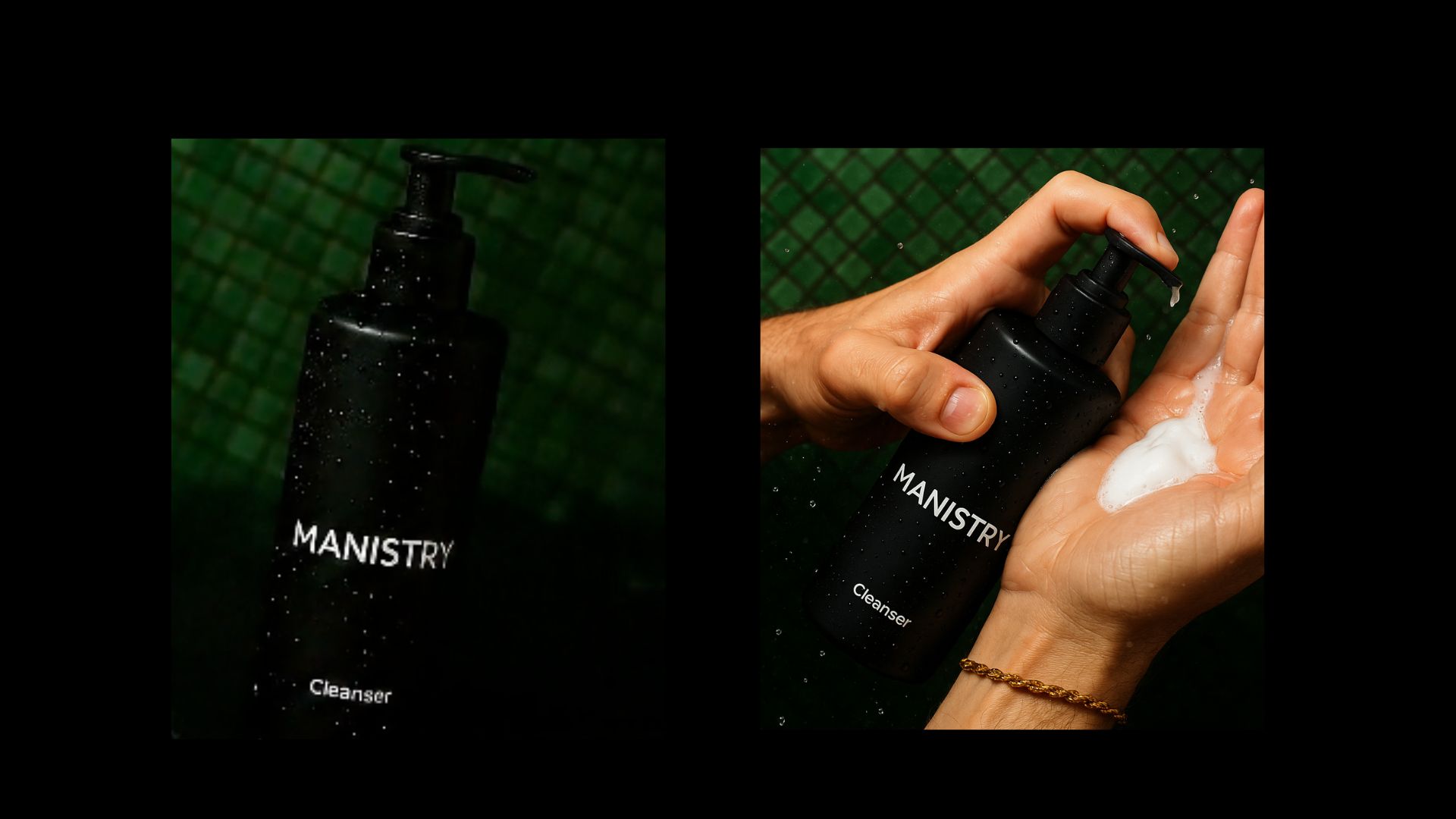
Project requirement was to only use black and white with black as the main color of the brand as the identity needed to to be as minimal, sleek and premium.
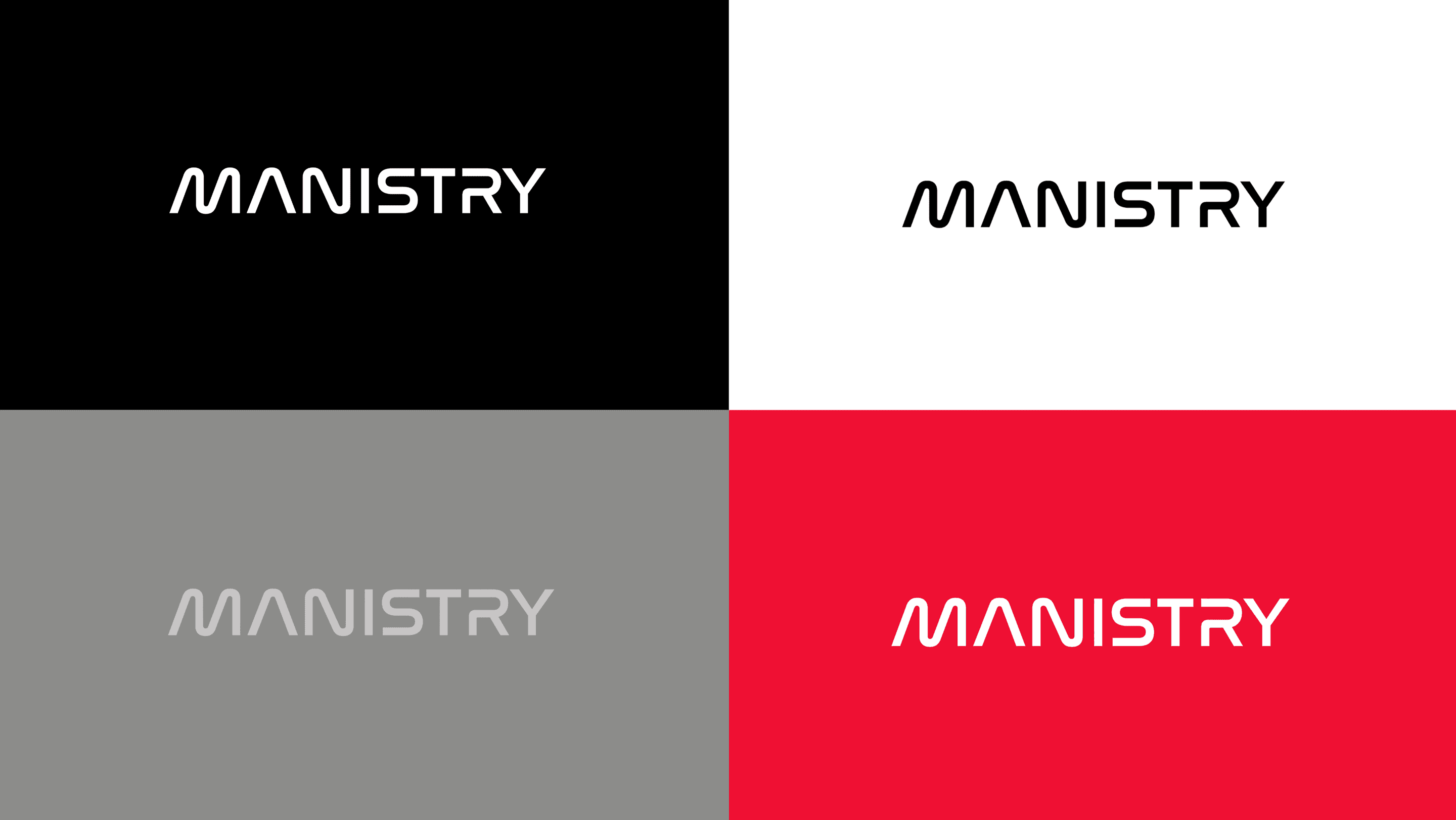
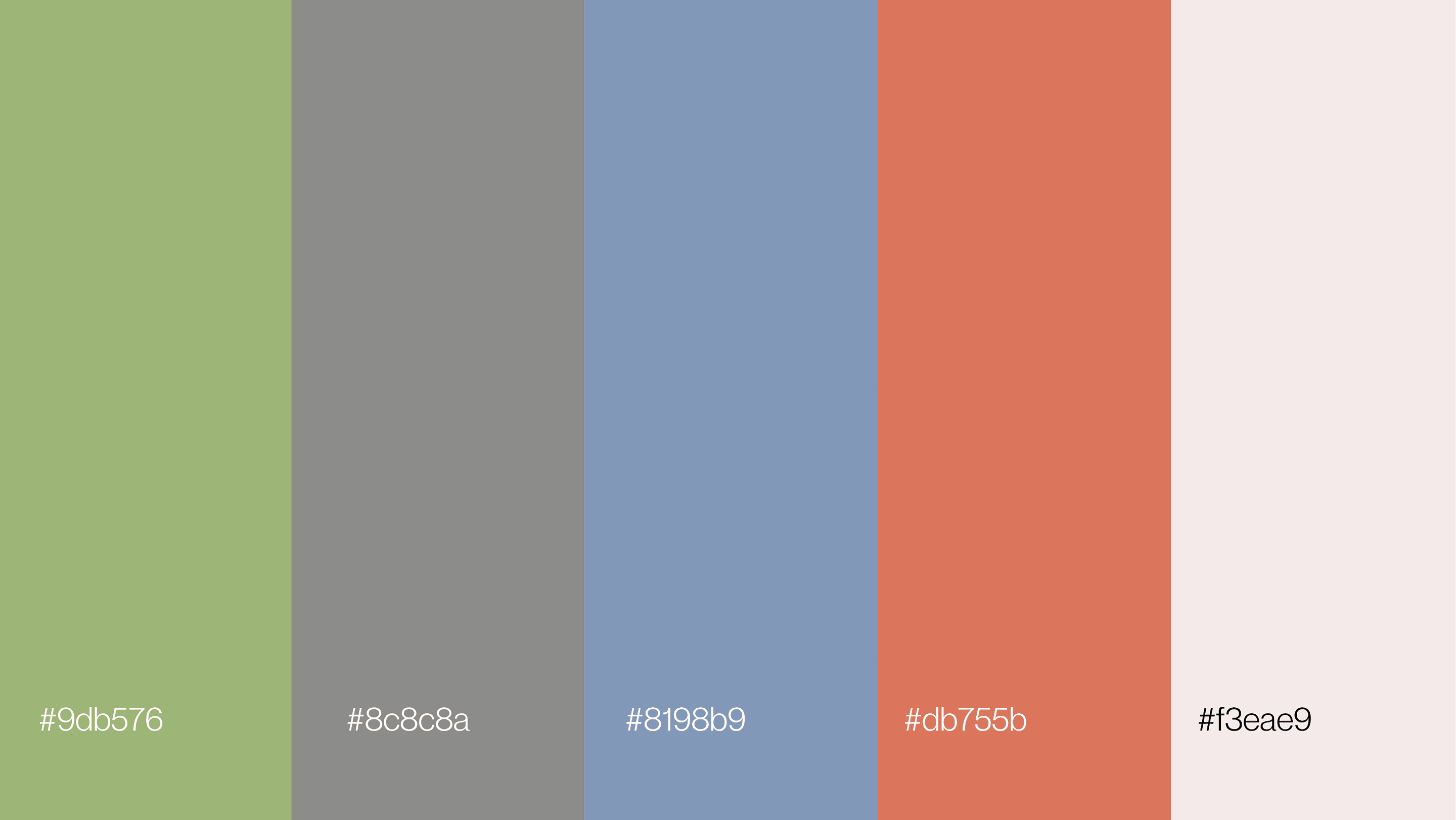
We created a grey scale colour palette for the brand and introduced bright red as a high contrast colour. The idea was to give a colour that can be used when the brand cannot use just black and white. The secondary colour palette was introduced for product variations. Colours being the most optimal way CPG brands differentiate their offerings and variants.
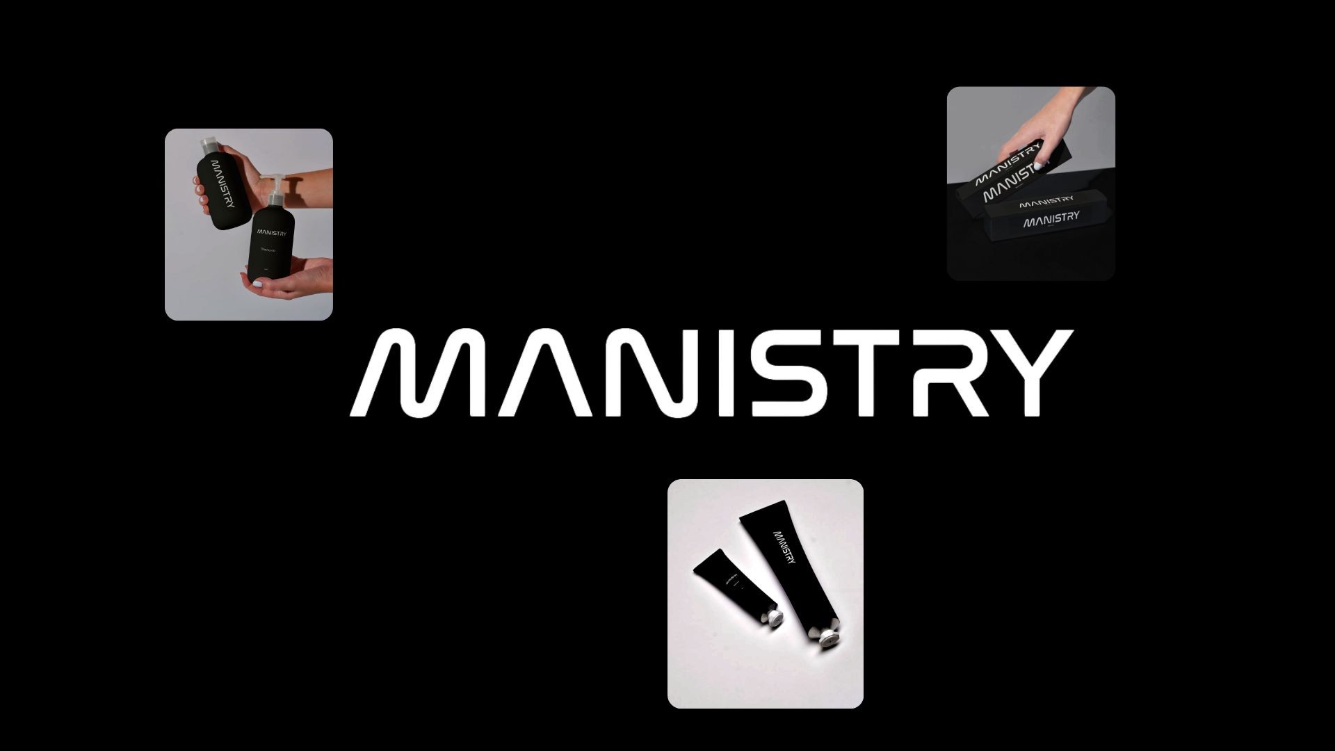
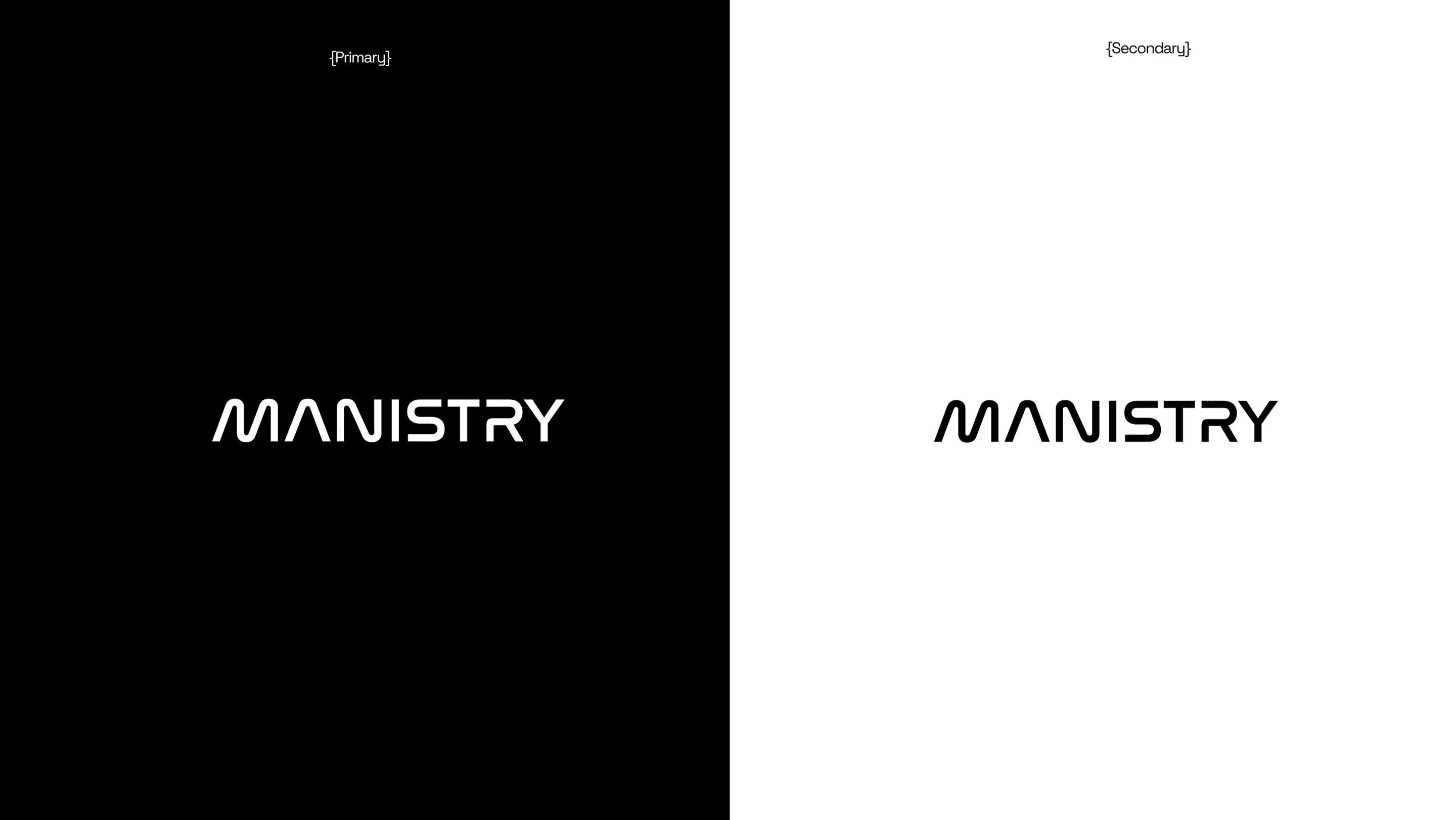

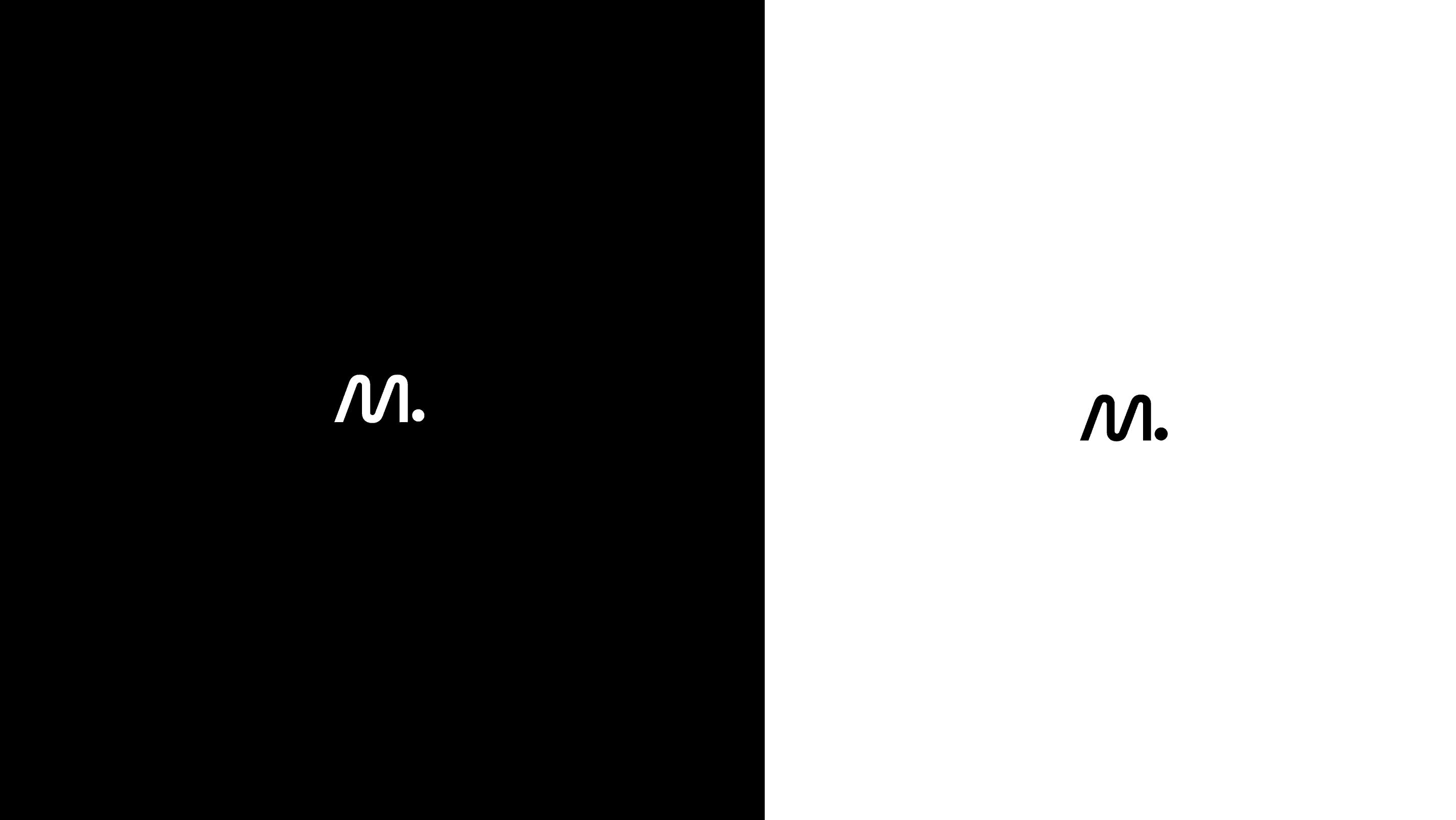
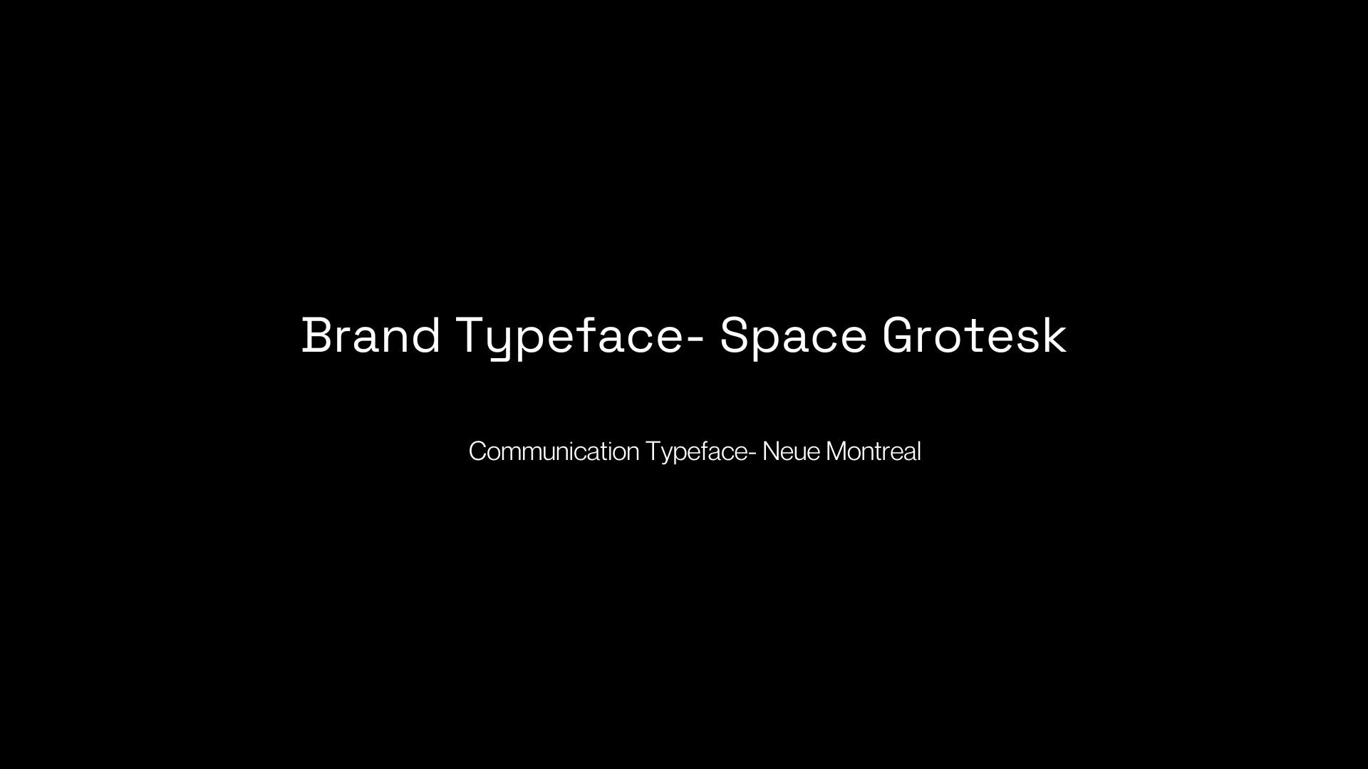
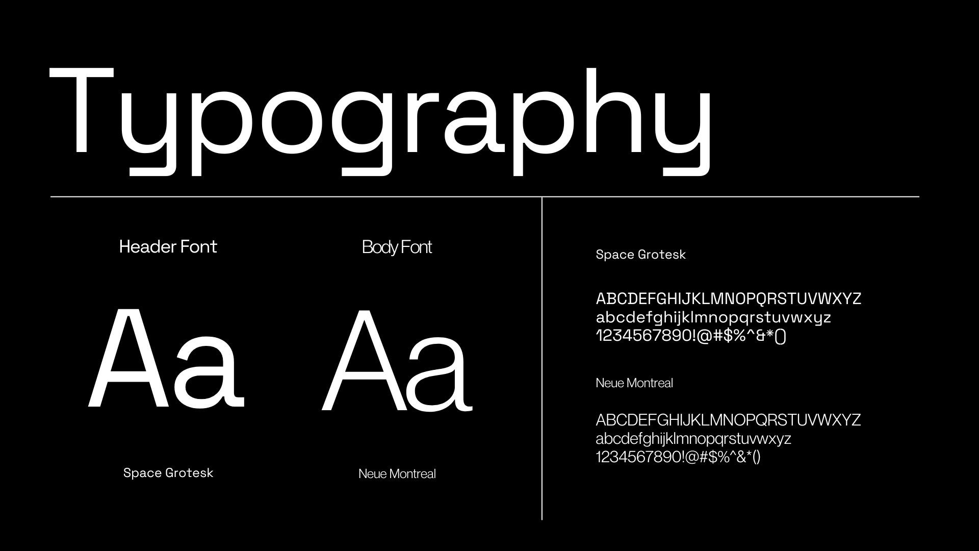
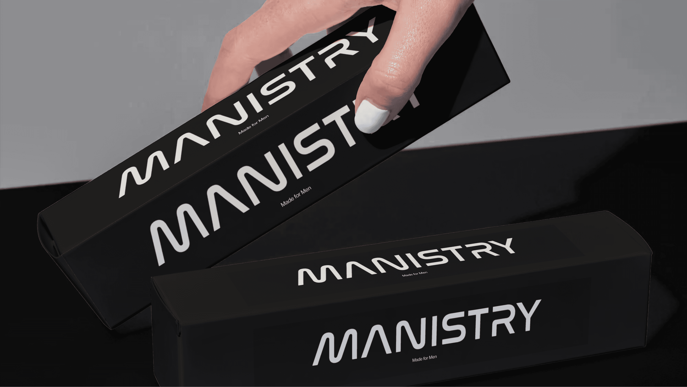
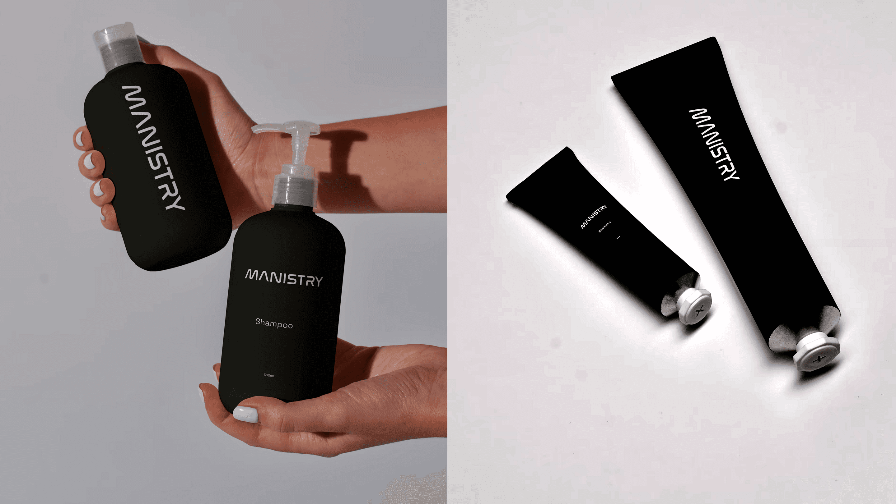
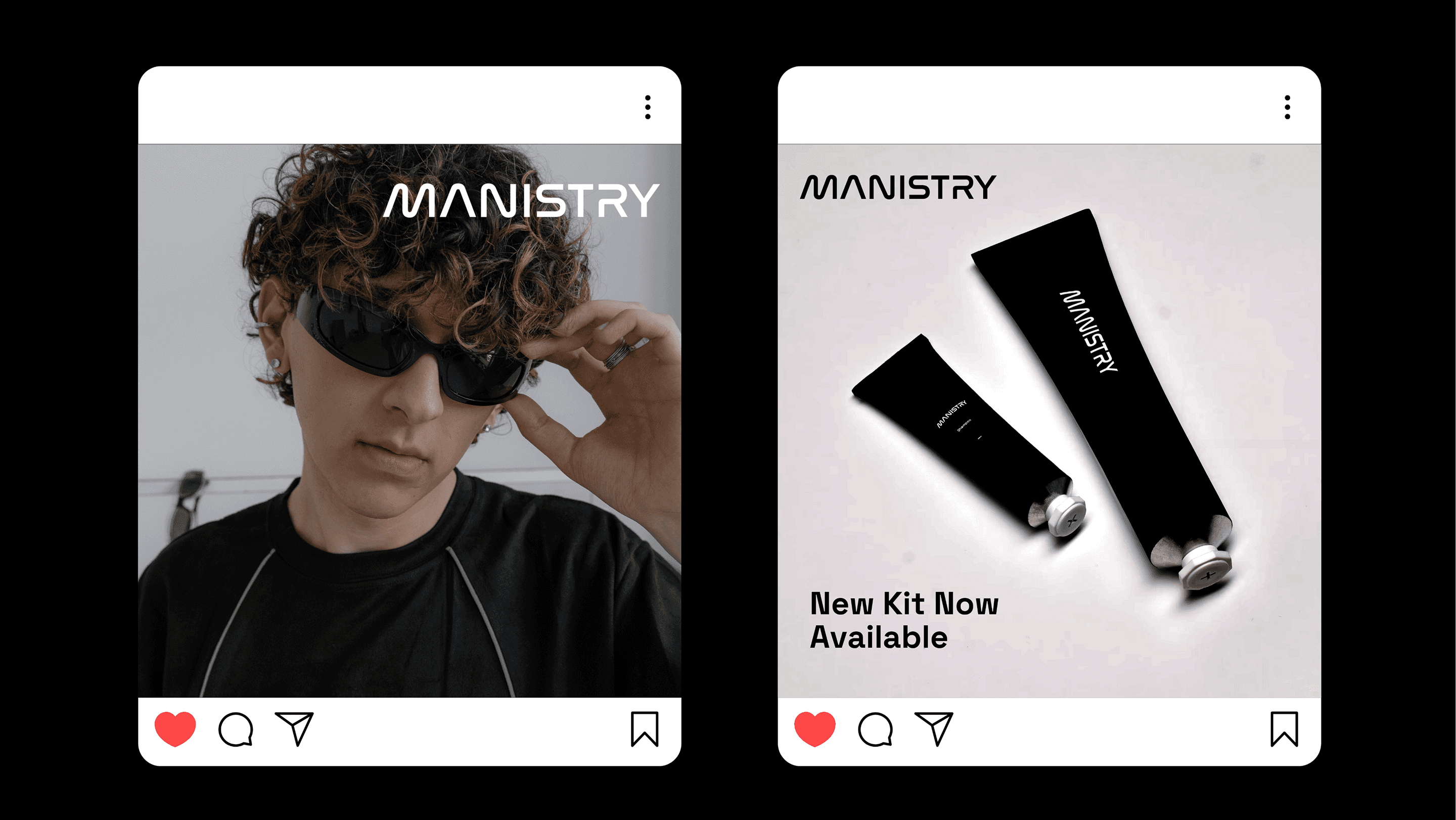
The primary logo of the brand is a sleek wordmark, supplemented by a social icon for spaces where the wordmark cannot be accommodated. However, they will not be used together in the identity anywhere. The typography choice of Space Grotesk was for the modern look and feel, paired with Neue Montreal for its clean and premium look on body and descriptive elements in the identity.
Let's work together - hello@beond.co
Book a Call
Have a project in mind? Reach out to us, and we’ll discuss the best way to move forward.

Anurag Attri
Founder & Creative Director