
The client approached Beond to create a Boho-inspired brand identity for a hospitality business that could grow into a wider cultural brand.
The identity needed to feel warm, contemporary, and approachable to its South Asian audience while working across dining, live performances, and community gatherings. Scalability was part of the original brief: the same brand had to feel at home on a café sign, takeaway packaging, a musical-event poster, or an outdoor pop-up. Our task was to give these different experiences a consistent identity, grounded in the meaning of Baithak and shaped by the character of Boho design. Design Strategy We built the identity around the rituals that make a baithak feel familiar. Our initial research explored three connected directions: Mughal architecture and gathering spaces; the collectible quality of Indian matchboxes, stamps, and stickers from the 1980s and 1990s; and the everyday culture of neighbourhood chai tapris. Each brought something different to the project. Mughal references informed our exploration of architectural motifs and gatherings centred on art and performance. This connected with the client’s ambition to host artists and musical events. Old printed ephemera offered a tactile, personal design language. The chai tapri brought the idea into everyday life: neighbours meeting over tea, reading the morning newspaper, and discussing what was happening around them. Together, these references gave Baithak a foundation that could support both a neighbourhood café and a wider cultural brand. The connection was the act of gathering, whether around a newspaper, a carrom board, or a live performance.
We translated these references into a contemporary identity, keeping the warmth and restraint of the Boho brief.
Architectural references became repeatable motifs and patterns, used across bags, packaging, and other brand applications. Stamps, matchboxes, and collectible print informed the paper textures, cut edges, stickers, and labels. An earthy palette of browns, beige, and cream brought these elements into one consistent visual system. The wordmark pairs English with Hindi and Urdu, reflecting the brand’s connection to a wider South Asian community. Expressive serif typography adds character, while the restrained layouts give the more detailed patterns and illustrations room to breathe. Illustrations of chai, floor seating, carrom, musical instruments, and UNO give Baithak a recognisable vocabulary for the different ways people can come together. These everyday references keep the identity personal and familiar while accommodating contemporary experiences.
The small details carry the idea of a neighbourhood gathering into the customer experience.
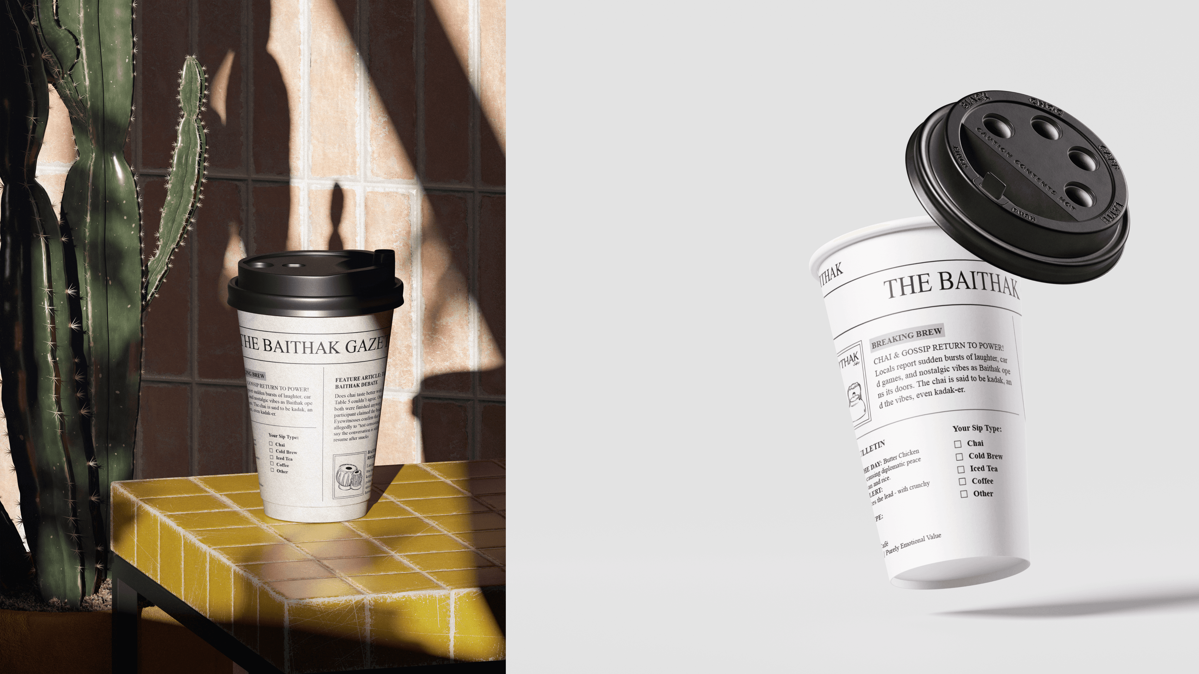
The Baithak Gazette turns a takeaway cup into a miniature newspaper, drawing directly from the morning ritual of chai and the news. Stamp-edged labels include space for customer names and order details, giving everyday packaging a personal touch. Patterns and illustrations connect the cups, bags, and printed materials to the wider identity. The same system extends into event communications and variations for musical gatherings, outdoor experiences, and locations. This gives Baithak room to grow while retaining the familiarity that shaped the brand from the beginning.




Next projects.

Book a Call
Have a project in mind? Reach out to us, and we’ll discuss the best way to move forward.

Anurag Attri
Founder & Creative Director