
Beond built Prynt's brand strategy and identity — a brand as trustworthy and modern as the platform it promises.
Printing is fragmented, inconsistent, and opaque. For a platform selling the opposite, the brand has to earn trust before the first order — and hold one tension: a technology company whose product is physical, needing to feel digital and modern while staying unmistakably about print.
We built the identity from the raw material of printing itself — CMYK and the halftone dot.
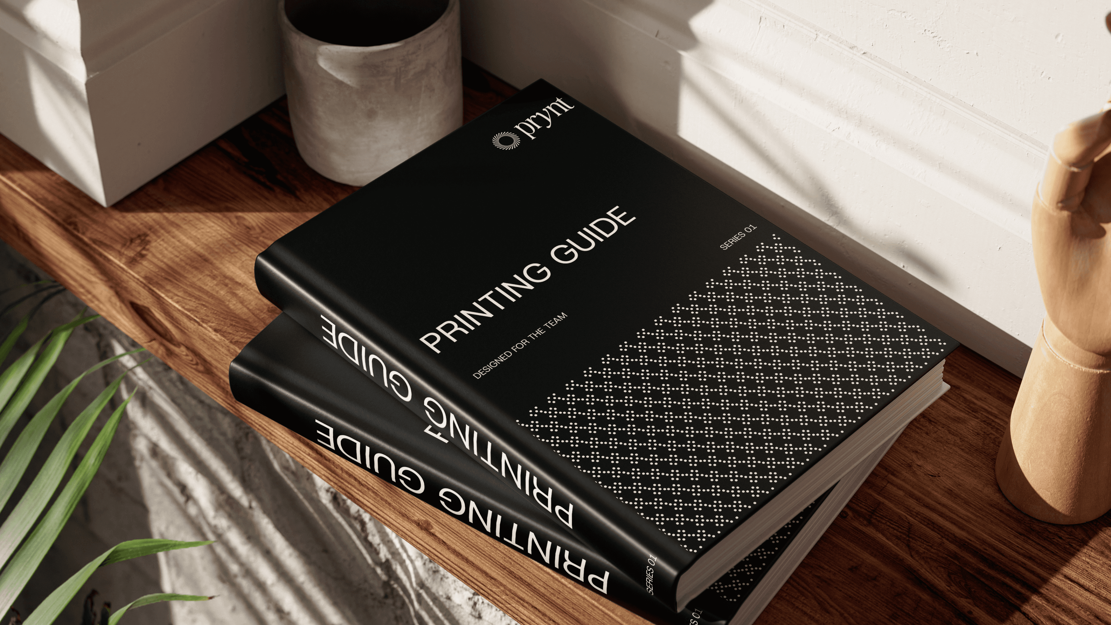
Rather than a generic tech look, we rooted Prynt in the mechanics of its own industry. The colour system is derived from CMYK; the brand pattern is the halftone dot. A serif display paired with a clean grotesk keeps it credible on a signboard and inside the app — an identity that could only belong to a printing company.
One system, built to flex across product, print, and three audiences.
Logo, colour, type, a halftone pattern library, and a custom icon set — applied across app, web, packaging, and signage. An audience-coded colour system gives small businesses, creators, and students each their own accent, all clearly the same brand.




Next projects.


Book a Call
Have a project in mind? Reach out to us, and we’ll discuss the best way to move forward.

Anurag Attri
Founder & Creative Director